There is more data available than ever before but companies are struggling to use it. Data storytelling can help.
Every day 2.5 quintillion bytes of data are created globally. It’s a number so large it’s hard for the human brain to grasp – and that number is growing quickly. In fact, 90% of the world’s data was created in the last two years alone and at the beginning of 2020, there was 40 times more data present in the digital realm than observable stars in the universe. Companies now have more data available to them and more readily than ever before. The potential of this data to drive business growth, innovation and improvement is huge. Yet, the Global Management Report found that 65% of Australian companies are struggling to turn their data into useful insights.
Alongside the rise of data itself is the proliferation of tools to analyse, store and present it. Dashboards in particular have grown in popularity over the last decade. Point and shoot tools like Power BI, Tableau, and Looker BI have made creating dashboards easier compared to years past. Visual interfaces, instead of code based interfaces, along with a plethora of online resources have made building dashboards more accessible to the masses. While dashboards are useful for visualising, slicing and comparing data, they do not generate insights from data – that is, dashboards cannot make meaning from the data they display. That requires human interpretation; moving beyond presentation and exploration to explanation and application.
Enter data storytelling. Many people have heard of it, but if you’re like the 100s of people Googling data storytelling in Australia every day, you might not be quite sure what it is or where to get started.

Data storytelling turns data into actionable insights
So, what is data storytelling?
Data storytelling is the ability to effectively communicate insights from data using three important elements – data, visuals and narrative to create engaging and easily understood actionable outcomes. It relies on knowledge of context, audience, purpose, and the ability to turn the results of data analysis into meaningful information.
Good data storytelling is linked to better business performance
Why is data storytelling important?
At the heart of why businesses collect and produce data is so it can be used to gain insights that (hopefully) lead to many business benefits. A recent study identified that a positive relationship exists between data storytelling competency and business performance. In other words, businesses that are good at storytelling with data perform better than those that aren’t.
To add to this, data is becoming an integral asset. Most businesses are undergoing a digital transformation to become more data-driven. A major component of this transformation is data democratisation – meaning that nearly everyone will have access to the data required for their job with little to no gatekeepers to get in the way. This creates an abundance of data across nearly all business domains which means that data, and using data effectively, will be an essential part of nearly all jobs in the future, if not already. This means professionals who have little to no experience using data in the past will be exposed to data in their jobs in one way or another. Think of it as a tidal wave of data that will eventually crash upon us all. From marketing, to human resources, to finance, most domains are now becoming data-driven and only those who can swim will survive.

So, if data storytelling is the key to turning an abundance of data into actionable outcomes, how do businesses and their employees improve their data storytelling skills? Let’s break it down into two key areas:
- Part one: What are the best practices for data storytelling?
- Part two: How can businesses best support employees to become better data storytellers?
This article will cover part one and examine best practises and useful frameworks to consider when creating a story with data.
Data storytelling how to: using a data storytelling framework
”Data stories combine visualisations with narrative flow. This combination can breach the barriers between people and data, engaging the former and delving deeper into the latter”
James Richardson, Research Director at Gartner
The essence of data storytelling is taking complicated, often large amounts of messy data and distilling it into meaningful insightful information for the audience. Let’s consider some data storytelling best practices:

Understanding your audience

Storyboarding

Effective visualisation

Identifying bias

Structuring a narrative

Inspiring action

Understanding your audience is the first step in data storytelling
When preparing to communicate with data, an essential first step is to understand the audience and how they would like to be communicated with. This includes who will be involved in the decision-making process and what their drivers are so that the approach can be tailored accordingly. Think through what the audience would want to know or do with the information presented – doing this would confidently and concisely answer the all-important “so-what” question.
How would the audience like to be communicated to? This would define the level of detail needed in the content and how it is tailored for the audience. Structuring the narrative flow to the specific audience will be covered a bit more in detail later in the article. It is also important to think about the tone by which the content is delivered to the audience. The tone that is decided on will have implications for the design choices that will be made in data storytelling.
Visually planning your data story through storyboarding helps organise your ideas and structure a narrative
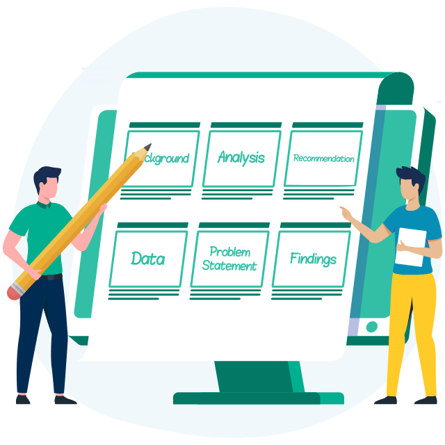
The idea of storyboarding was first developed at the Walt Disney Studios during the early 1930s. They used this process to plan the sequence of scenes for their animated films. Today, this technique is used in many areas like training courses, live-action movies, presentations, and so on. Similarly, storyboarding has a role to play in data storytelling, especially where there are multiple components involved that would need to be organised and arranged in a manner that suits the target audience and their needs. This technique would also prove useful in a team setting, where different individuals can pull all of their contributions together and build out the storyboard together. Remember, the storyboarding step might not be required always, especially when what needs to be communicated and to whom is pretty straightforward.
Storyboarding is something that can be done early on when planning to communicate with data – the process takes a step back from visualisation and presentation software, and solely focuses on how the different pieces fit together and visually outlines the content to be created. Keep it simple and use a whiteboard and post-it notes where content can be easily added, removed, or rearranged to explore various narrative flows. In today’s new reality of virtual collaboration, there are many online whiteboarding tools like Miro, Mural (and plenty more) that can help achieve the same outcome. Don’t think that this can be done in one attempt. Storyboarding is an iterative process that takes more than a few attempts to get the storyline right.
The whole idea behind storyboarding is that it helps sequence the flow of events and helps identify potential gaps where more supporting data may be required. It ensures that there is a solid understanding of what is required before creating content, and this will usually save time later on. Think of it as a plan for the narrative which is often useful to refer back in those times of dealing with nitty-gritty details. In short, it helps data storytellers to see the forest from the trees and stay on track.
Being aware of bias is important for fair and accurate data storytelling
Identifying bias when undertaking data storytelling is important for the quality and usefulness of the end product – and subsequently the quality of decisions it informs. Bias, in its broadest sense, is defined as favouring one view or another, particularly in a way that is unfair. Identifying and/or addressing bias is a key aspect of data ethics, in particular in honouring the ethical principle of ‘fairness’ – see our ethics in AI article here.
There are lots of different types of bias (more than 200!), many of which can be relevant to particular aspects of data-related work. As data storytelling is a later step following data collection, presentation and analysis, it is important to consider bias (and data ethics more broadly) in all the steps that lead up to the final hurdle of data storytelling. If this is not done, bias in earlier steps can inadvertently influence what is produced in the data storytelling phase. For example, it is important to consider sampling bias during data collection, and cognitive biases during data analysis. It is therefore important to ensure that bias is considered, identified, mitigated where possible – and where mitigation is not possible, documented with full transparency – at each stage of the process preceding data storytelling.
Reflecting on personal biases can help mitigate bias in data storytelling
Our biases can often be implicit or even subconscious so it’s not always easy to identify them ourselves. We may (consciously or unconsciously) favour creating a story that supports our own interests. For example, favouring one use case over another because it supports our own line of business rather than simply drawing on the data in a neutral way and crafting a story using the message of the data itself. To overcome this, it is important to let the data lead the story rather than selecting data to support a foregone conclusion or preferred storyline.
Another common issue encountered when undertaking data storytelling in business is confusing correlation with causation. This can happen due to cognitive biases such as confirmation bias or the illusion of causality or when reviewing complex data where it can appear that there are causal relationships between changing data points where in fact there might not be. To prevent this occurring, it is important to avoid making assumptions, and instead to experiment and investigate explainability to determine whether changes in data indicate causation or correlation. By reducing bias, this will support data storytelling to be more accurate and truthful.
Including diverse perspectives in data interpretation improves the quality of your data storytelling
Another way to support more accurate data storytelling is to consult with individuals who are part of the story. For instance, it may be useful to get input/feedback on the data story so it captures what is important from the perspective of those who the story is about. For example, data storytelling crafted from data on customer behaviour could be strengthened by input and insights from the customers whose behaviour the data describes.
Case study
A great example of including diverse groups in data storytelling is found here. Burnie, a port-city in north-western Tasmania has faced the challenge of long-term intergenerational unemployment, and generally lower education and economic outcomes compared to the average Australian. An Australian civic tech company partnered with local community members to help address these issues. Collaborating with local community groups in “data walks” (where analysis and findings were shared with the local community members) allowed for the local community to add context, validate, and correct findings. Ultimately, the data walk workshops aligned the data and story components to appropriately reflect a clearer community-centric understanding of how to address the economic and social issues ahead of Burnie. In short, by including the community to add their voice to the findings only enriched the data story.
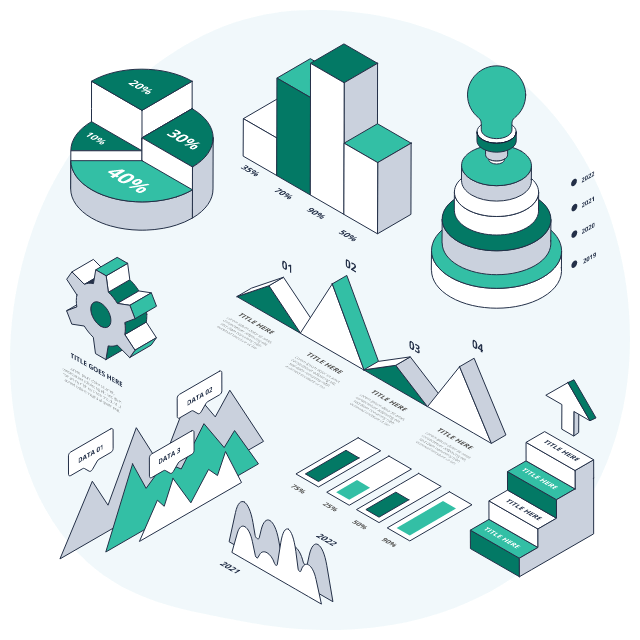
Effective visualisation is key to data storytelling
Once the data has been identified, the next step is to determine how best to visualise it. There are many different ways data can be represented – simple text, table, scatterplot, line/bar graphs, and heatmaps, just to name a few. It is essential to select the visual that best communicates the salient points to the audience (remember, understand the audience). So, when it comes to communicating with data and building out visuals, think like a designer. Keep the audience in mind and consider what they would like to see.
There are some simple rules to follow to help create clean, easily digestible, and striking data visualisations:
- Declutter and keep it simple – identify unnecessary and irrelevant information that might be a distraction to the audience. Consider summarising to take out the details and just highlight what is critical to communicate. Keep the visualisation clean, legible, approachable, remove unnecessary complexity and try to use simple, straightforward language.
- Clear visual hierarchy – arrange elements to clearly show their order of importance and how the audience should process the information communicated. Be smart with colour and strategically highlight and focus the key points in the visual.
- Use words wisely – to communicate effectively and make sure everyone is on the same page when looking at the visuals, it is encouraged to use text along with the data visuals to title, label, reinforce, highlight, recommend and communicate the story effectively. Make words stand out, to avoid any questions the audience may have when looking at the visuals.
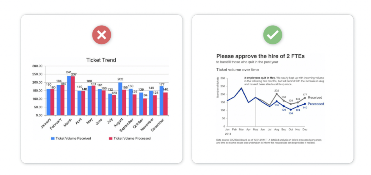
As seen in the above example, effective visualisation heuristics can be applied by decluttering, arranging elements clearly and using titles/labels to highlight and focus the audience’s attention on key points. The difference between an average visualisation and an excellent one can drastically change what the audience pays attention to and the conclusions they draw. The last thing anyone wants is two people to draw two very different conclusions from the same chart. Consider seeking feedback from colleagues or even from the audience (if possible), to iteratively improve on the design, making sure that it meets the audience’s needs and that they are constantly engaged.

Structuring a narrative using effective visuals and data as evidence
Even the most beautiful visuals run the risk of failing to meet the desired intent without a compelling narrative to go with it. To be able to effectively communicate with data, it is essential to combine data findings and effective visuals with a powerful narrative!
When structuring a narrative, it is done generally with a beginning, middle and end. Tension and conflict can help grab and maintain the audience’s attention. Think about the order in which the narrative flow is structured for the specific audience – are they busy executives who would rather be led with what is required of them? Do they care about the process or just the answer? Are they required to make a decision or take action? One way to order the story is to do so chronologically (the natural way), where they are taken through a general analytical process of identifying the problem, gathering and analysing the data, and then followed by insights and recommended actions. Another option is to lead with the ending, that is, start with the derived insights or call to action, and then back that up with critical pieces of the story to support it. This strategy works well when the audience is more interested in the “so what” than how we got there. Choose what structure works best based on the circumstance and the audience.

So what next? Inspiring action through data storytelling
It is not enough to provide the audience with insightful takeaways and nothing more – they might not know what to do with the information presented. For the data story to be complete, try and provide the audience with some guidance to move forward using these insights; inspire them to drive action and change! Look for an opportunity to create a sense of urgency around solving a potential problem identified or seize an opportunity before it’s too late. At times, it might be a struggle to develop actions and recommendations, in these scenarios, it might just help to leverage the collective know-how of the audience and formulate the best course of action.
To summarise
Data-driven businesses are increasingly looking into and improving their data storytelling competency – moving beyond presentation and exploration to explanation and inspiring action – to drive performance! It is important to keep a few things in mind when communicating with data – understand the audience and their drivers, storyboard early on to plan and outline key events, think like a designer when building visuals, identify bias and blindspots and finally structure a compelling narrative using effective visuals and data as evidence that inspires actionable outcomes.
In the second part of this series, we’ll look into how businesses can best support employees by continuously upskilling them with effective storytelling skills, improving on their organisation’s data capabilities and building out a data-driven culture that embraces data as the heart of making decisions at every level of the business.
How Mantel Group approaches data storytelling
At Mantel Group we believe data storytelling can help companies distil insights of the greatest potential value and lead to transformative action through data-driven decision making. We achieve this by delving into the components that help to make information intuitive and compelling. Data is the foundation of all insights, but is trapped in a sea of rows and columns (or keys and values, hello event streaming friends) until it is presented visually. Us humans are not only visual creatures, but our brains are also wired to follow a narrative. By pulling apart key steps taken to arrive at insights and anticipating the ‘so what’, the explanation goes a long way in presenting compelling actionable insights. By weaving visualisations and narrative together an audience is more likely to get onside and be convinced to take action. It’s our mission to uncover the story within data that allows for transformative insights and greater business value.
Mantel Group ensures that the expertise required for delivery is always easily met. No matter your data storage infrastructure or cloud provider we have the technical capability to build a back end that is future proof and scales as you grow. We are also able to combine our data thinking with human-centred design expertise, which helps us centre our data storytelling on who the story is for.
